FTR: New heatmap illustrates COVID-19 impacts on truck rates
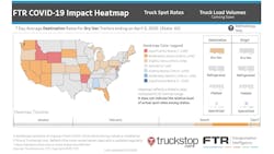
As part of its ongoing work to shed light on the impact of the novel coronavirus (COVID-19) pandemic on the transportation industry, FTR recently released a new interactive dashboard.
The FTR COVID-19 Impact Heatmap assesses the state-level rate impacts by four trucking equipment types—dry van, refrigerated, flatbed and specialized—using truckstop.com spot market data. Each combination of states and equipment type reflects rate trends for the states both as origins and destinations using the most recent seven days from the date selected. This publicly available map is viewable now at ftrintel.com/coronavirus.
“Truck drivers and the companies that employ them are on the front lines of America’s response to the coronavirus crisis,” said Avery Vise, FTR vice president of trucking. “Trying to keep up with the myriad state and local restrictions and fluctuating conditions can be overwhelming, but as markets often do, truck spot rates naturally reflect these stresses. By showing how rates in individual states deviate from what FTR assesses to be the norm absent the COVID-19 crisis, we believe we are providing a valuable analytical tool to shippers, brokers and carriers, and even to those who simply want to understand how the crisis is affecting US commerce.”
FTR’s analysis examines historical seasonal behavior regarding rates in each state and normalizes the data to represent how the trucking environment would look in a typical growth economy. By comparing that norm to the current rate environment, we can understand how COVID-19 is affecting rates on a state-by-state basis.
The data used to create the heatmaps compare the most recent seven days to the same seven days over the last five years. This data is then compared to the last month—January—during which COVID-19 had no significant impact on US transportation. Because of inherent data variations, “normal” is defined as a range rather than a specific number. The maps’ color variations indicate the degree to which rates deviate—higher or lower—from that normal range over the most recent seven days. A slider function allows the user to change the snapshot for any date to provide a seven-day lookback for any date going back to early January. This feature provides insights into how the COVID-19 impacts have changed over time.
It is important to understand that the heatmaps reflect the status of a given state’s rates compared to its own normal range. It does not indicate anything about the relative level of actual spot rate levels among states.
“The Coronavirus pandemic is unlike anything we’ve ever seen in the industry,” said Brent Hutto, chief relationship officer at truckstop.com. “It is more important than ever to give freight industry professionals accurate, up-to-date information so they can make informed decisions and keep our nation moving.”
